uefi-ui
Bedrock UI — Design Manual
The following principles describe the visual language of Bedrock UI as we understand it: a system built entirely from first principles, starting with the question how do you make a flat screen feel physical?
1. The Core Premise: Depth on a Flat Surface
Every pixel in a UI is drawn on a flat plane. Yet users feel more confident and accurate when controls behave like physical objects — things they can press in, grab, slide, or pick up. The challenge is to create that sense of weight and depth using only colored pixels.
We solve this with a single, consistent rule:
Light enters from the top-left corner.
That is all. Everything else follows.
If light comes from the top-left, then:
- The top and left faces of a raised object catch the light → they are lighter.
- The bottom and right faces fall into shadow → they are darker.
- An inset surface reverses this: its top-left is shadowed, its bottom-right is lit from below.
A button that looks raised is clickable. A field that looks sunken is writable. These are not conventions we ask users to learn — they are physical intuitions they already have. We are simply mapping them to pixels.
2. The Four-Border System
We reproduce depth with exactly four edge colors arranged in two concentric rings:
┌──────────────────────────────────────┐  outer TL: border_lightest (#fefefe)
│ ┌────────────────────────────────┐   │  inner TL: border_light    (#dfdfdf)
│ │                                │ ──┘  inner BR: border_dark     (#848584)
│ └────────────────────────────────┘      outer BR: border_darkest  (#0a0a0a)
└──────────────────────────────────────┘
Two pixels of border on each side, four distinct shades. Nothing more.
Raised (button, panel): bright on top-left, dark on bottom-right. Sunken (text field, depressed button): dark on top-left, bright on bottom-right — the inversion. Flat (status panel, groupbox label cutout): a single 1px mid-tone, no depth.
The face of every control is filled with face (#c6c6c6) — a neutral gray, the same across every widget.
This uniformity is intentional: the depth comes from the border, not from gradients or textures on the face.
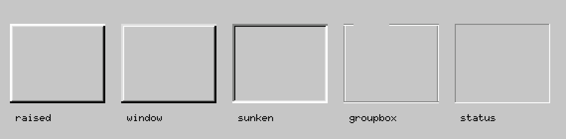
| Variant | Method | Description |
|---|---|---|
raised |
draw_raised |
Buttons, scrollbar thumbs, window frames |
window |
draw_raised_soft |
Softer raised look for panels and popups |
sunken |
draw_sunken |
Input fields, list boxes, gallery panels |
groupbox |
draw_groupbox |
Etched section frame |
status |
draw_status_border |
Status-bar cells, single-layer inset |
3. The Minimal Color Palette
We work with a deliberately small set of semantic colors:
| Token | Hex | Role |
|---|---|---|
face / surface |
#c6c6c6 |
Button/panel face |
canvas |
#ffffff |
Input field interiors, text area background |
accent / selection_bg |
#060084 |
Title bar fill, selection, focus |
caption_on_accent |
#fefefe |
Text on navy |
background |
#008080 |
Desktop |
border_lightest |
#fefefe |
Outer top-left bevel |
border_light |
#dfdfdf |
Inner top-left bevel |
border_dark |
#848584 |
Inner bottom-right bevel |
border_darkest |
#0a0a0a |
Outer bottom-right bevel, primary text |
tooltip_bg |
#fefbcc |
Tooltip fill |
Color is function, not decoration. The navy accent (#060084) appears in exactly two roles: the title
bar and the selection/focus state. The teal desktop (#008080) never appears inside a window.
4. Surface Hierarchy
Controls live on one of three surface levels, each visually distinct:
| Level | Color | Appearance | Examples |
|---|---|---|---|
| Desktop | #008080 |
Flat teal | Root background |
| Panel | #c6c6c6 |
Raised gray | Windows, dialogs, button faces |
| Input | #ffffff |
Sunken white | Text fields, list boxes, dropdowns |
White areas are where data lives. Gray areas are where controls live. Three levels, no more.
5. State Communication Through Shape
Every interactive state maps to a physical condition:
| State | Visual | Physical analogy |
|---|---|---|
| Idle / clickable | Raised (border_lightest top-left) | Protrudes from the surface |
| Pressed / active | Sunken (border_darkest top-left) | Pushed in by a finger |
| Focused | Dotted 1px inner rectangle | A chalk outline marking “here” |
| Disabled | Mid-gray text + white shadow offset | Inert, does not respond |
| Selected (list row) | Accent fill with white text | Picked up from the surface |
| Checked (checkbox) | Sunken field + drawn checkmark | The mark sits inside the well |
The user never reads documentation to understand these states. The states feel correct.
6. Typography: Dense and Direct
We use bitmap pixel fonts at 6×10 px for UI chrome (labels, menus, status bars). For document content areas, a proportional TrueType font at 10–20 px.
Rules:
- Labels are left-aligned, vertically centered in their row height.
- Text color is
border_darkest(#0a0a0a) on any light surface; white (#fefefe) on the accent navy. - No letter-spacing, decoration, or color variation for emphasis within UI chrome.
- Truncate with
…when space runs out; never wrap chrome labels onto multiple lines. - Menu accelerator keys are shown as underlined characters, enabling keyboard-first use.
7. Spacing and Density
| Constant | Value | Used for |
|---|---|---|
| Bevel depth | 3 px | Border on all raised/sunken widgets |
| Control inner pad | 5–8 px | Left/right margin inside containers |
| Row height (chrome) | 22 px | List rows, menu items |
| Row height (labels) | 20 px | Label rows in panels |
| Button min height | 23 px | All push buttons |
| Icon size | 16×16 px | Folder, file, and toolbar icons |
Bevel (3 px) + inner pad (5 px) = 8 px from any container edge to content.
8. Window Anatomy
┌─[outer bevel: raised]────────────────────────────────────────────────────┐
│ [title bar: accent fill, 30px tall, label + close button]                │
│ [menu bar: face fill, 20px tall, flat text labels]                       │
│ ┌─[inner bevel: raised]──────────────────────────────────────────────────┐│
│ │ [content area]                                                          ││
│ └─────────────────────────────────────────────────────────────────────────┘│
│ [status bar: sunken strip, 20px tall]                                    │
└───────────────────────────────────────────────────────────────────────────┘
9. Widget Gallery
Buttons
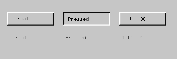
Push buttons use draw_raised at idle and draw_sunken when pressed. The default button (activated
by Enter) gets an additional 1 px black outer ring. Title-bar buttons (Min/Max/Close) use the same
raised chrome at a smaller 18×18 px size.
Checkbox
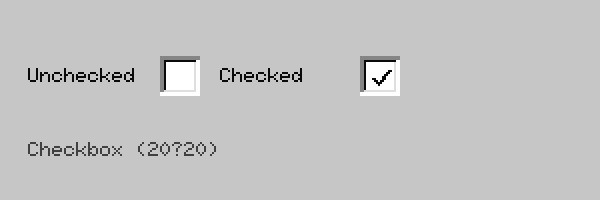
A 13×13 px sunken well sits inside a 20×20 px cell. The checkmark is an L-shaped two-stroke drawn
in border_darkest. The label follows 8 px to the right, vertically centered.
Radio Buttons
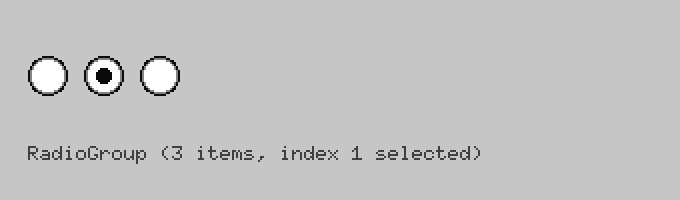
Each option occupies a 20×20 px circle. The outer ring is a concentric three-layer bevel (black outer →
gray middle → white interior) giving a sunken appearance. The selected option shows an 8×8 px filled
dot in border_darkest centered in the white area.
Toggle
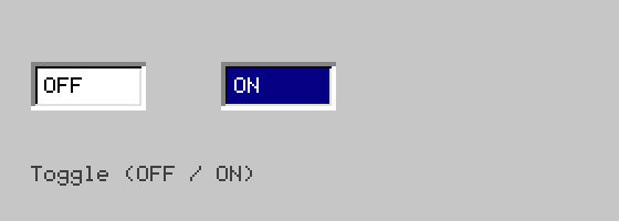
Two sunken fields side by side: the inactive half filled with canvas, the active half filled with
selection_bg (navy) + white text. Clicking either half is a binary switch.
Slider
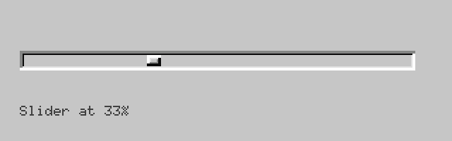
A sunken horizontal track with a raised rectangular thumb at the current ratio position.
draw_slider_track_thumb takes a 0.0–1.0 ratio and thumb width; the thumb is drawn via draw_raised.
Progress Bar
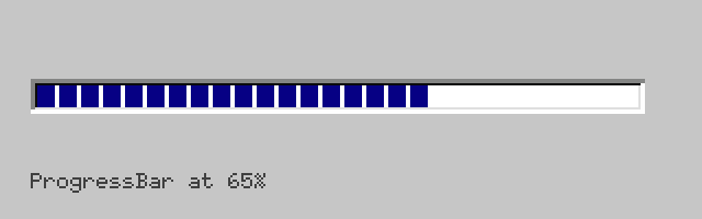
A sunken container filled left-to-right with a solid progress_fill block. Per spec (T-09), this
should eventually be chunked 8 px blocks with 2 px gaps.
Tabs
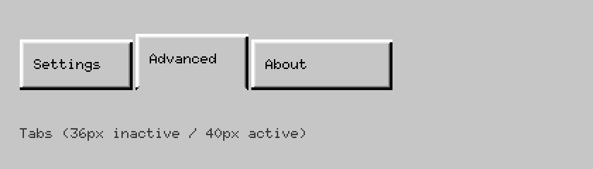
Inactive tabs are 36 px tall; the active tab is 40 px (raised 4 px) with its bottom border erased so it merges visually with the panel below. Rounded top corners are trimmed by 1 px.
Combo Box / Dropdown
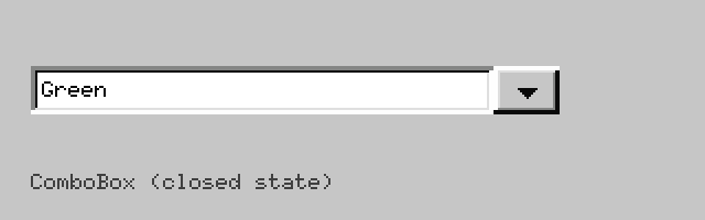
A sunken text field paired with a 30 px raised arrow button on the right.
draw_combobox_chrome + draw_dropdown_glyph (7×4 pixel triangle, no Unicode required).
List Box
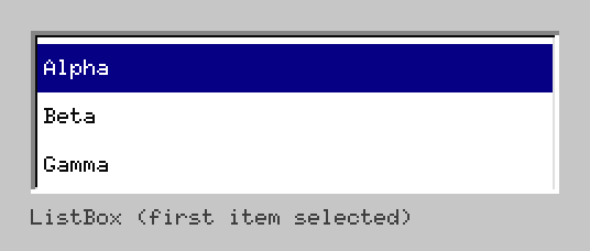
A sunken container with 22 px rows. Selected row uses selection_bg + white text.
draw_sunken_field + draw_listbox_row per row.
Scrollbar
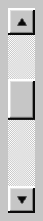
Two 26×26 px raised arrow buttons with triangle glyphs at each end. The track between them is filled with a hatched checkerboard pattern. The thumb is a raised rectangle that shrinks proportionally to the content size (minimum 17 px).
Separators
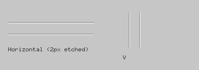
draw_separator_h / draw_separator_v — a 2 px etched line: border_dark on the first pixel,
border_lightest on the second. Produces the classic engraved groove at 1/10th the cost of a full bevel.
Group Box
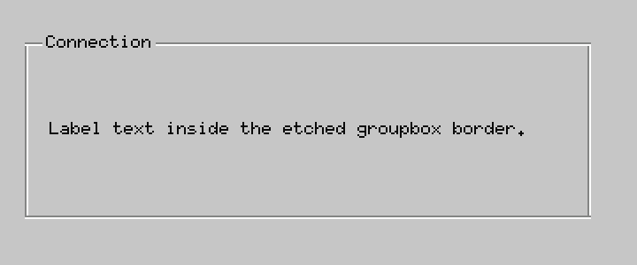
An etched rectangular frame drawn via BedrockBevel::draw_groupbox. The label text is positioned
in a gap cut out of the top border line. (T-20: the gap background needs to be filled with face
so the border line does not bleed through.)
Tooltip
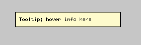
A tooltip_bg (#fefbcc) filled rectangle with a 1 px flat border_darkest outline — no bevel.
Tooltips do not protrude; they have no depth of their own.
Hatched Background
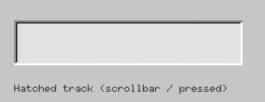
draw_hatched_background — an (x+y) % 2 checkerboard of face + border_lightest. Used in
scrollbar tracks and depressed button states to signal “this area is not content.”
Status Bar
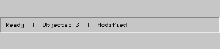
BedrockBevel::draw_status_border — a single-layer inset border (top/left = border_dark,
bottom/right = border_lightest). Lighter weight than a full bevel; communicates “read-only.”
Line Graph
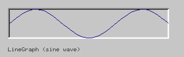
LineGraph widget: data points mapped to a rectangle, connected by embedded-graphics Line primitives.
No axes or labels — purely the polyline inside a sunken container.
File Picker Dialog
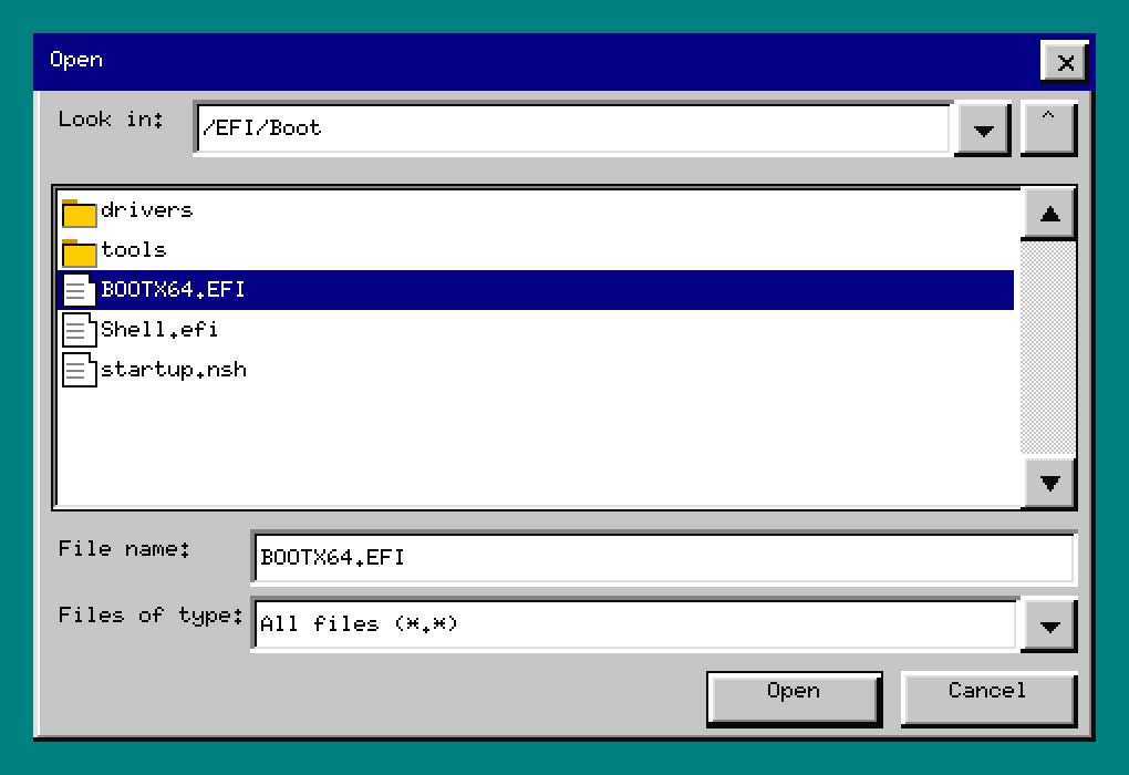
draw_file_picker + compute_file_picker_layout. A full Open/Save As dialog with:
- Left pane: directory tree (
draw_tree_view) - Right pane: file list with folder/document icons
- Bottom: filename text field, file-type dropdown, OK/Cancel buttons
- Tab / Shift+Tab cycles focus between zones; arrows/Enter/Escape route per zone.
Tree View
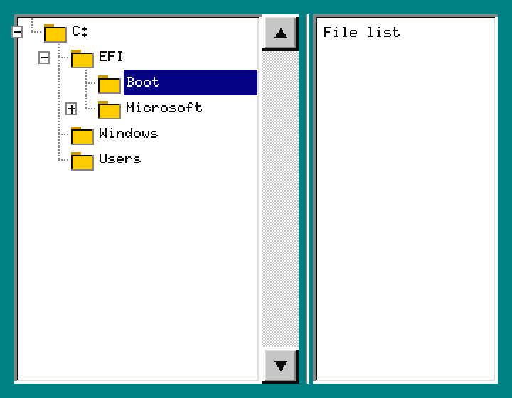
draw_tree_view — directory tree with dashed connector lines, +/- expand boxes, and 16×16 px
folder icons. TreeViewState + FlatRow (a continues_mask bitmask tracks which ancestor levels
still have siblings below, enabling correct connector drawing at every depth).
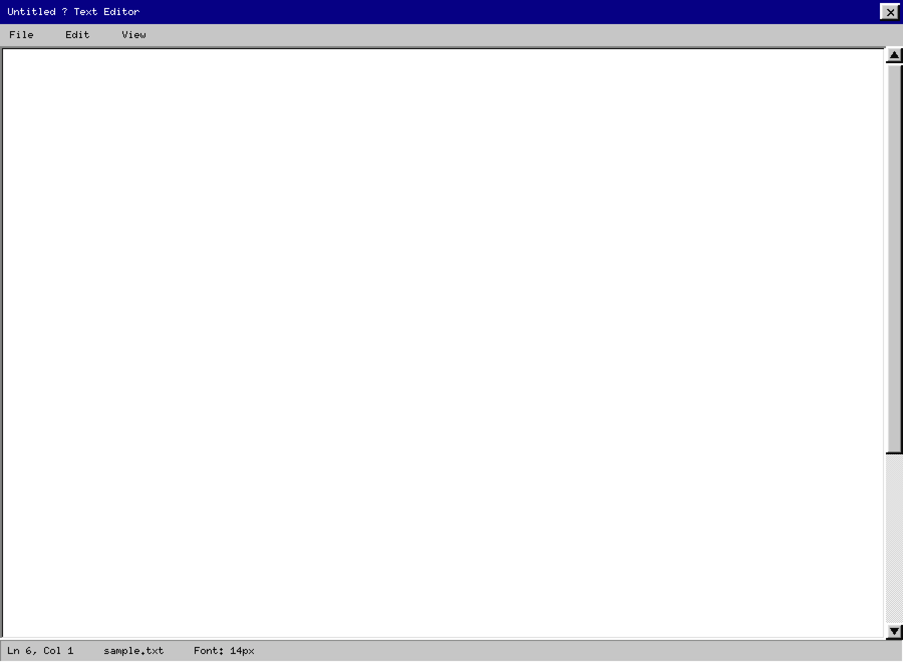
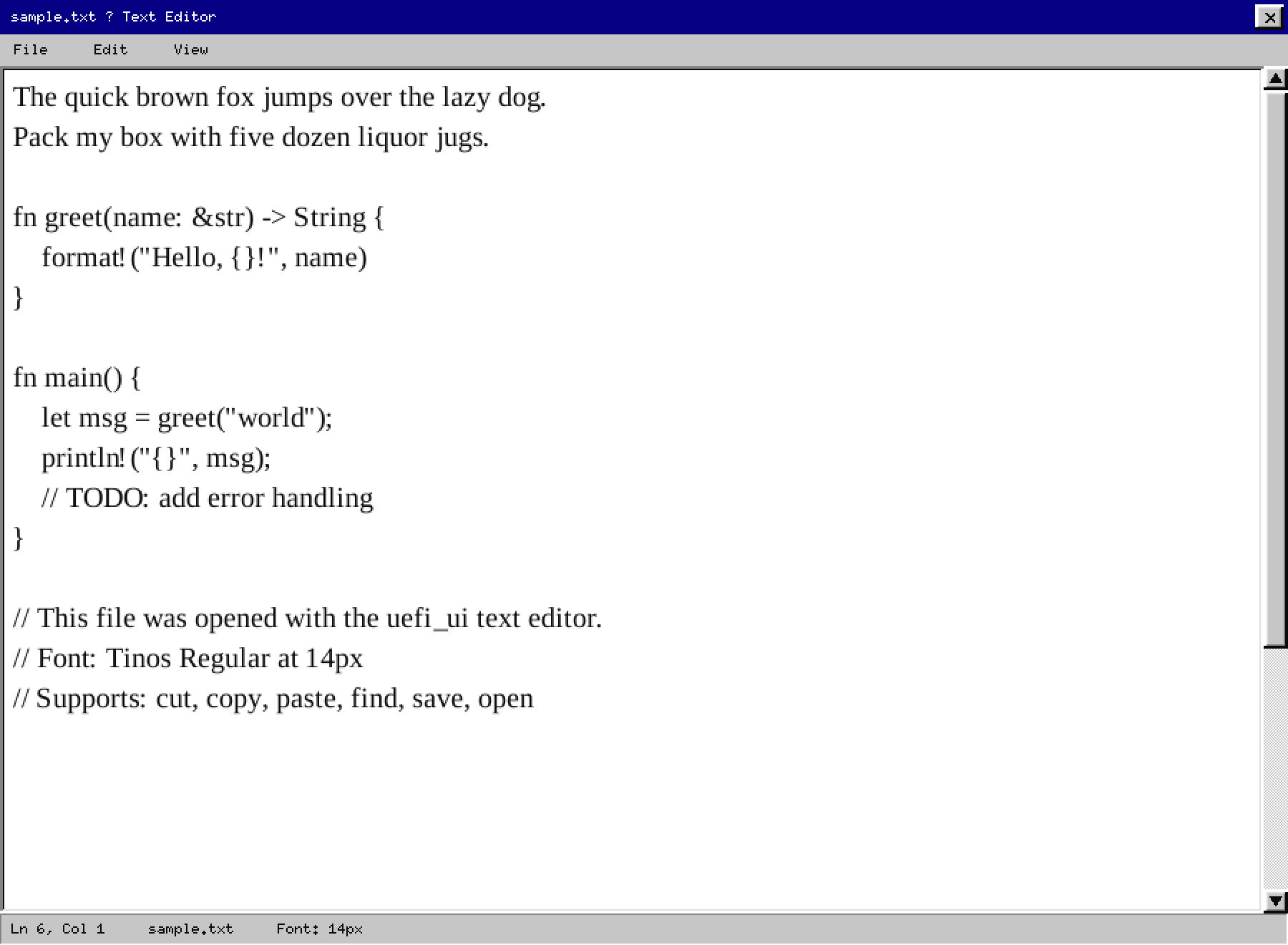
10. Text Editor
A complete Text Editor built on the widget library.
Run: cargo run -p uefi_ui_prototype --bin editor --features sdl
Default state
Text content with selection highlight
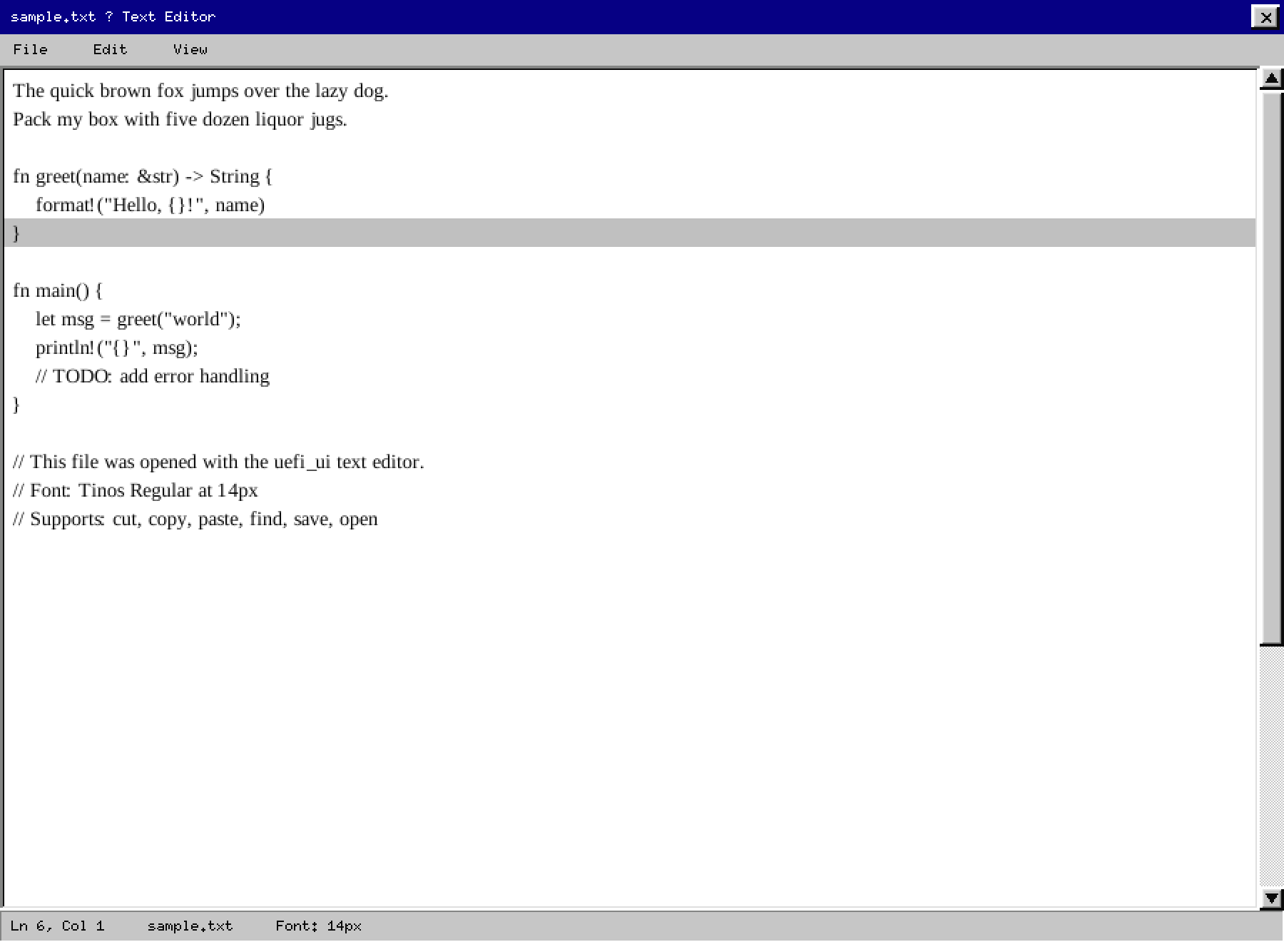
Selected text uses a light gray background (#c0c0c0) with dark ink — never navy. The selection is a
row-level highlight behind the glyphs, not an overlay on top.
File menu open
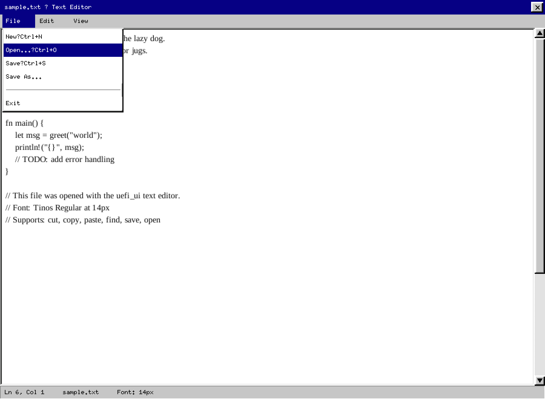
The active menu item is highlighted in navy. All other items remain on the gray surface.
Find bar (Ctrl+F)
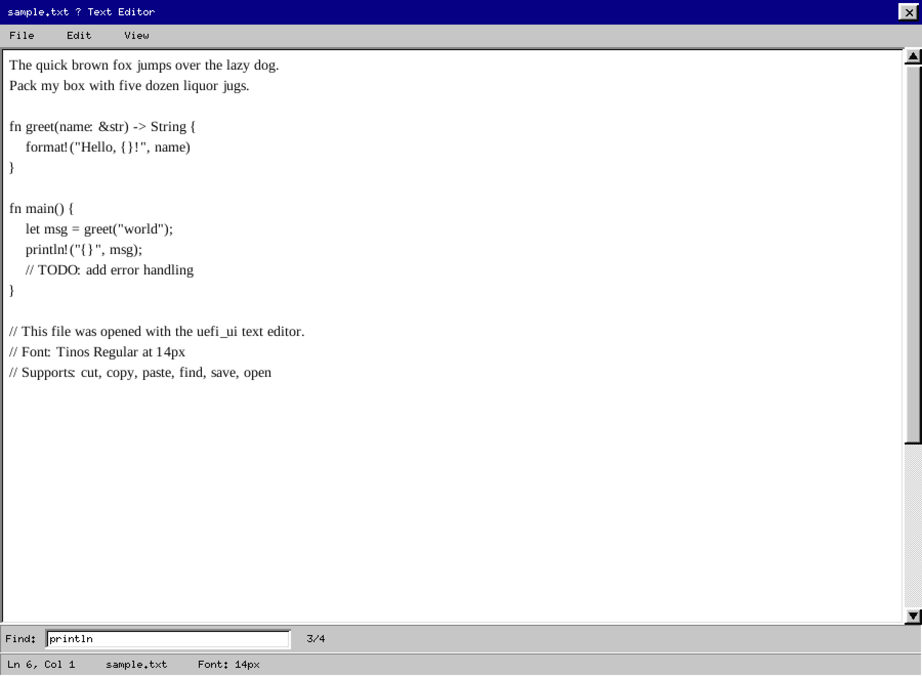
The find bar slides in above the status bar. Yellow background marks all occurrences simultaneously; Enter / F3 cycles through matches.
File picker overlay (Ctrl+O)
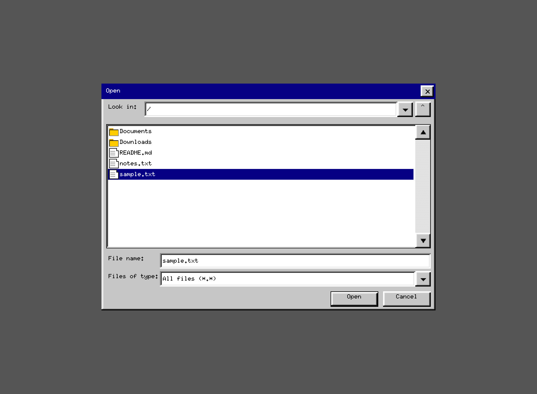
The editor dims to a hatched overlay and the Open dialog appears centered. Escape cancels without disturbing the document.
Larger font (Ctrl++ / View menu)
Font size cycles: 10 → 12 → 14 → 16 → 18 → 20 px. Text reflows automatically. The TrueType font
(Tinos Regular) is rasterized per-glyph via fontdue with alpha blending onto the white canvas.
11. Icons
Icons are 16×16 px pixel art:
- Folder: yellow body (
#fecd22) + dark outline; tab flap visible on top. - Document: white body + folded top-right corner + colored detail inside.
Icons never change color when selected. The row highlight behind provides selection feedback. This keeps the icon’s semantic identity stable across selection states.
12. Dialog Conventions
- Dialogs have a raised outer bevel + title bar.
- The default action button (usually “OK”) sits bottom-right.
- Button clusters use 6 px gaps between buttons.
- Content has 8 px margin from the window edge on all sides.
- Menu items that open a dialog end with
…(ellipsis). - Destructive actions use the same button style — safety comes from the prompt, not button color.
Escapecancels;Enteractivates the default button.
13. What We Do Not Do
- No drop shadows (only the bevel illusion — never a blurred soft shadow)
- No rounded corners
- No gradient fills
- No animations or transitions
- No translucency
- No color-coded control types (all buttons are the same gray)
- No auto-hiding scrollbars
Every omission is deliberate. Complexity in the visual layer must be justified by a proportional gain in comprehension.
14. Open Tasks
See ../tasks.md for the current list of visual improvements and parity gaps.